Posted by Leonard Steinberg on January 25th, 2014
Many developers are in a quandary: what is the ‘next’ design direction and how do you deliver this without taking on too much risk. In the last few years we have seen new adjectives emerge in the different styles of finish-out……here are some:
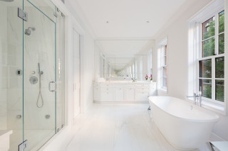
1) Richard Meier-esque: The king of minimalist modernism inspired a wave of all white, sleek no-hardware kitchens and clinical bathrooms juxtaposed against walls of glass.
2) Roman and Williams-esque: These ex-theatre-set designers created a look that is the polar opposite of modern minimalism. While some have described their look as historical recreation, looking at some of their work such as at the Standard Hotel their clever mix of recent historical references with a modern twist has inspired an entire movement. The volume of knock-offs is diluting this look a bit, and some may argue that Thomas O’ Brien invented it.
3) Williamsburgy: Some developers and their mediocre designers (not to mention their inept advisors and marketing teams)simply have no design sensibility whatsoever, let alone a creative bone in their bodies. We all know that hideous, pseudo-modern, cheaply constructed Williamsburg condominium look that’s a mild notch above Home Depot. Look! The kitchen has a Sub Zero!
4) Zaha-Hadid-Space-Ship-esque: This look was first seen at 166 Perry Street, where there is a strong prospect of running into Mr. Spock in the lobby. Space-ship design works in some buildings, but done inexpensively can look very throw-away. This look can be risky as it is polarizing, yet there is a young audience out there that loves this look and swears by it.
5) Boutique-W-Hotel-esque: Here residential buildings often land up looking like middle-of-the-road boutique hotels, so international in style that they literally could be anywhere in the world. Oddly, this look can be very satisfying to a wide group of people, and it is used very widely often in larger buildings in an attempt to create intimacy. It is safe. But its beginning to look a tad boring. And much of it does not age well.
Recently new building apartment finishes have soared in quality, fueled by Walker Tower, where Shaun Osher pushed the developer hard in a tough market knowing quality would resonate. Some of the design choices I thought were wrong, but the market loved them and paid up handsomely for them. The Marquand at 11 East 68th Street took this level of finish-out to an even higher level, and its level of sophistication has in my opinion remained un-challenged.
So where do we go from here? How much design can a developer install without dictating too much? What are the next trends for 2014? I have a few ideas, so we will re-visit the subject this time next year and reflect.
